

Our AI Knew Our Colors and Fonts. It Didn't Know Our Brand.
A brand kit tells an AI which colors and fonts to use. It never says why. How we built First Light, our visual identity, with AI: the story first, a rule for every no, three directions, then tokens and a spec deep enough to design from.


In this article
You give the AI your brand kit: the hex codes, the fonts, the logo files. It does exactly what you asked.
The headline is in your typeface. The button is your orange. The background is close enough to your cream. Nothing is technically wrong.
And it looks like everyone else’s.
So you start art directing. More premium. Less busy. Warmer, but not that warm. Each round fixes one thing and breaks another, because you are describing a feeling the AI was never given. A few assets in, you have become the design system. Every page waits for your eye.
We had our own version of this. The design tools had never been more impressive, and our work still looked flat. The AI knew our colors and fonts. It did not know our brand.
Here is the flip. A brand kit is not a visual identity. A visual identity is the story your colors and fonts are telling, written down with the rules that keep it true. Give an AI the story and the rules, and it can design when you are not in the room. Give it the kit, and it can only guess.
That is how we built First Light, the identity on this site, with Claude. Colors and fonts were the last thing we settled, not the first. Four steps, in the order we would run them again.
- Tell the storyWe gaveWho we are, who we are not, the sunrise seed.It handed backA character built around our own picture of the brand.
- Explain every noWe gaveReferences, and a reason for every yes and no.Rejected: golden clouds. Why: first light is the start of the day, not a sunset. Rule: generate neutral, grade warm.It handed backRules the brand must never break, each with its why.
- Ask for three directionsWe gaveThose rules, the story, the creative director role.It handed backThree directions and one recommendation.
- Write tokens and a specWe gaveThe chosen direction and our reaction to every round.It handed backA system with its reasons written beside each rule.
Your visual identity is a story, not ten colors and ten fonts
When people see you, they judge you. How you show up says something about your business, and not only what you look like. It says what you care about.
Most people hear “design system” and think font and color. But most visual identities worth copying have an idea behind them. A story.
Ours started with a picture, not a palette. The sun is coming up. Something is happening, but you still need to navigate, and the stars show what is possible. That is what we believe our buyers are living through. The story came first. The colors came out of it, and so did the photography, the horizon line and the way light moves down a page.
The story matters to an AI for a plain reason. “Warm, not golden” means nothing to a model until it knows the brand is a dawn and not a sunset. It matters to the business for a reason our sellers care about as much as our marketers: consistency makes us look bigger than we are. One idea carried through every asset reads like a company. The same swatches on a different layout every time reads like a tool.
Step 1: Tell the AI the story, and every later choice gets a reason
A designer who joins your company does not start with the logo. They ask who you are. Ask the AI to work the same way, before it touches a pixel.
The point of the questions is to force choices. Not a list of good qualities every company claims, but who you are and, just as useful, who you are not. Four of the questions from our guide:
- Who is the customer when things are hardest for them? What are they carrying?
- Name three traits the brand has, and for each, the trait it is often confused with that you are not.
- Who are you not? Which kind of company, tone or look would embarrass you?
- Is there a picture, a moment in nature, an object or a metaphor that feels like the brand, however rough?
Here is where we landed. Who we are: the experienced growth leader you pull a chair over for. Who we are not: another vendor shoving AI at you all day. The rough picture was the sunrise, with one more detail: dark mode is the sun rising, light mode is the sun risen. I am not a creative director, and I said so. What I asked for was a real creative process.
What this step gives the AI: a reason behind every later choice. What it gives you: a character to check a design against before you argue about a color.
Step 2: Explain every no, and every no becomes a rule the AI can check
This is the step a brand kit skips, and it is where the work starts paying you back.
Most mood boards collect things you like. Ours became useful when we said, out loud, why each reference worked, why it did not, and whether it felt like us. Then we wrote every reaction in four parts:
- Reference: a glass dashboard floating over golden clouds.
- Verdict: feels like us, except the gold.
- Rule: the product floats over a real landscape; morning light, never golden hour; the sun never in frame.
- Why: our story is first light, the start of the day, not a sunset.
A hex code tells the AI which orange. A rule tells it the orange is never a wash, never a glow behind text, never the color of a headline. The first is a swatch. The second is taste it can apply when you are not there.
Here is the no that taught us the most. The generated skies kept drifting blue and grey, so I said warmth and energy were critical. What came back was worse in the other direction, and arguing with the prompt was not going to fix it.
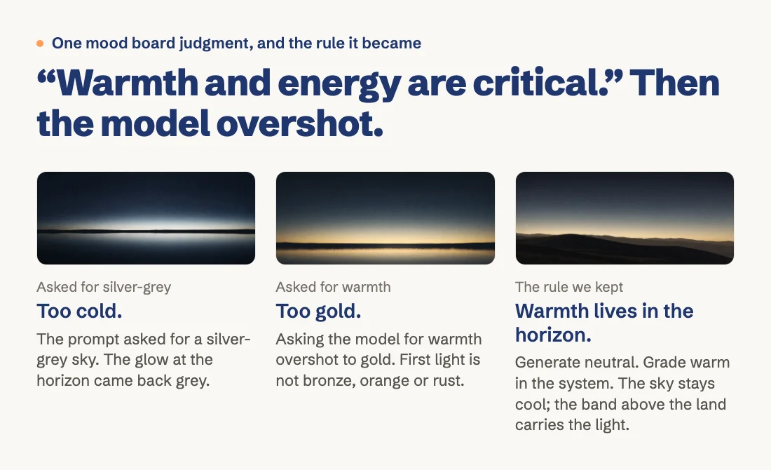
The rule works because warmth stops being a request. It becomes a measured band the system adds to a neutral sky, the same on every picture, so nothing depends on how a model hears “warm” that day.
Write a page of these and you hold something a brand kit never does: a list of what the brand refuses, with the reason attached. The check: do you have more rules about what the brand never does than about what it does? You should.
Step 3: Ask for three directions, so you choose between stories instead of swatches
With the story and the rules in hand, we asked the AI to do what an agency does in a pitch: come back with three distinct directions, each with the story it tells, and a recommendation.
The recommendation was the useful part. It did not stop at a favorite. It shipped the first direction as the system, took a single detail from the second (the horizon as a warm glow under a hairline), and kept the third for a narrower job. That third direction turned the whole page into an instrument reading, with the navigation as a bearing scale, and on the pages where a buyer is trying to read about the product it would be, in the AI’s words, “one instrument too many.” The combined direction became First Light.
What this step gives you: a choice you are qualified to make. You do not have to judge kerning. You have to judge which story is true about your company.
Step 4: Write tokens and a spec, so a fresh session still designs your brand
Now the AI could design. The way to think about what it needs is Lego. Tokens are the colored bricks you have. The spec is how they may be put together. Our bricks are navy, orange and cream, but cream is the base, navy anchors it, and orange is the pop. That lives in the spec, because you can put those three bricks together in a lot of wrong ways.
The first attempt did not land. The story was right; the execution painted with it.
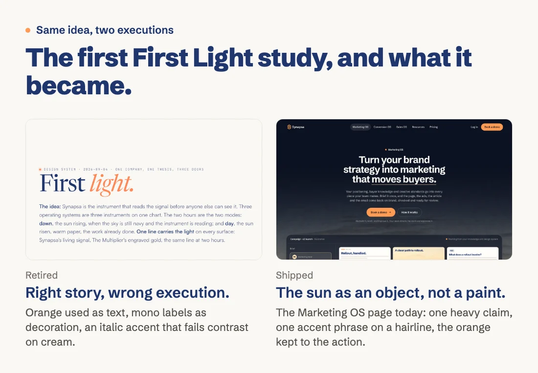
Left, the first study, now retired: orange as text, monospaced labels as decoration, an italic accent that fails contrast on cream. Right, the Marketing OS page today: one heavy claim, one accent phrase on a hairline, the orange kept to the button. We keep the retired study so the AI sees what not to repeat.
The spec went deeper than colors and fonts. Three layers did the most work.
Color comes from the photograph. We stopped choosing colors in a picker and cut the palette from three approved landscapes instead. Nothing drawn on the page fights the world behind it.
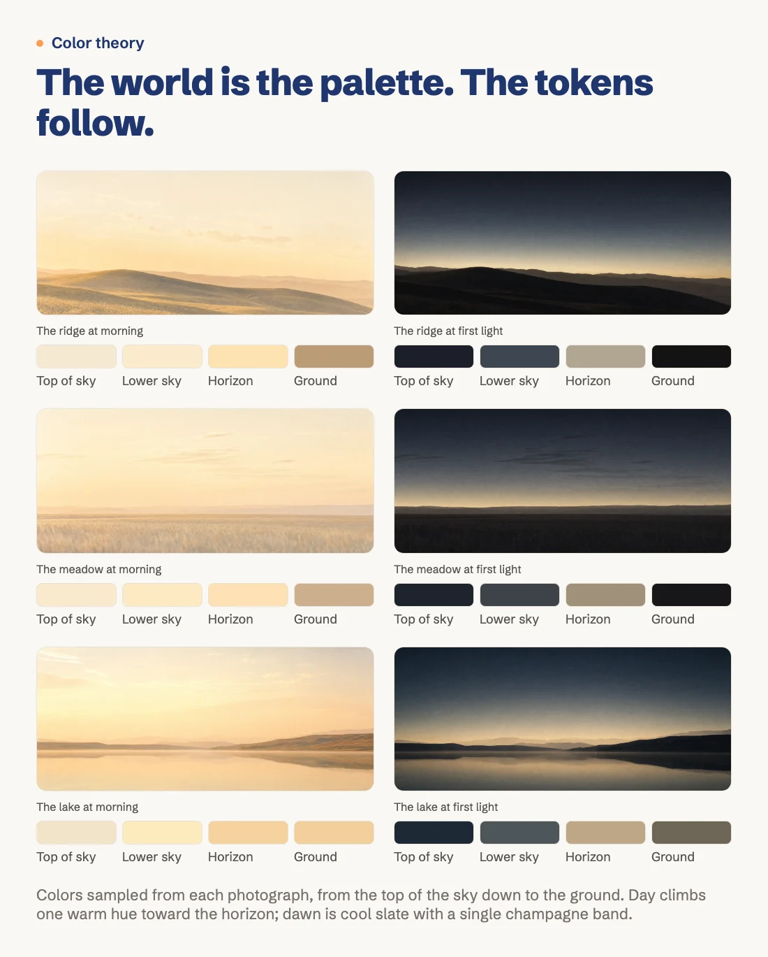
The same three landscapes at two hours, sampled from the top of the sky down to the ground. Day climbs through one warm cream toward the horizon. Dawn is cool slate with a single champagne band. Those samples became the tokens.
Shapes are a short list. Five drawings and nothing else gets in: the line, the horizon, the dial, the trace and the floating plate. A short list is what keeps an AI consistent.
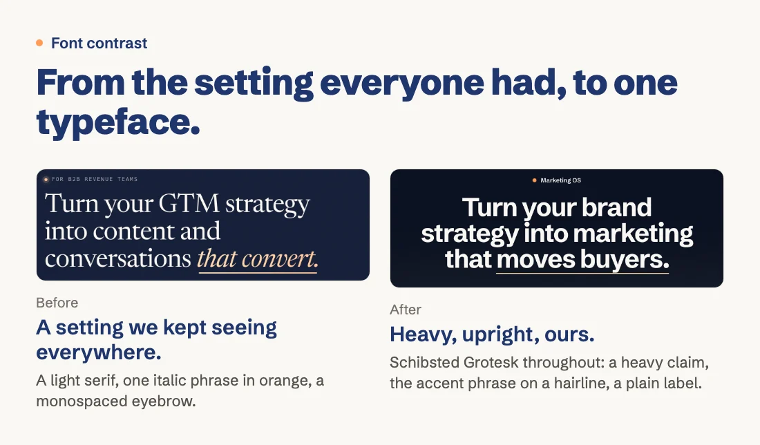
Type changes the setting before the face. We kept seeing the same headline on AI-made pages, and ours had it too. Ask whether your setting looks like everyone else’s before you ask which typeface. We changed the setting first, and the face followed.
Every rule in the spec comes with the judgment that explains it. Here is one rule, with the token names swapped for plain words, and the line that gives it its reason:
The sun: the primary orange is the action and the sun, always as an object: the button, the ball on the line, the lit tick and arc on the dial, the dot beside a label. Never a wash, a glow behind content, a fill on navy, a rim, or a text colour.
What an imitator gets wrong: they paint with orange, where Synapsa lights with it: a ball, a tick, an arc, one button.
The reason is the story. There is one sun in a dawn sky, and it is a thing you can point to, not a tint over everything. The quote keeps the file’s own spelling.
The test we hold the file to: two designers given it should produce the same brand, never the same layout. That file is what our AI reads before every visible asset now.
Start with one interview and one rule; the rounds get fewer from there
Any capable model can run this. Most of the work is still yours, and that is the point. The AI can ask the questions; only you can answer them truthfully. Ours took a long day of back and forth, then follow-up studies.
Here is the progression to expect. Before, every asset waited for your eye. After the story and the first page of rules, the AI starts from your refusals instead of your corrections. The measure is how many assets still need a sit-down. At first, most. Then fewer. The ones that still do tell you which rule is missing. Write it down with its reason, and the next asset starts further along.
This week:
- Run the interview. Answer the four questions above out loud, and write down who you are not.
- Write one rule in four parts from the last design you rejected: reference, verdict, rule, why.
- Test it in a fresh session. Give a new session only the file, and ask for a page you have never designed. If it comes back as your brand in a layout you have not seen, the file is working. If not, the gap names the next rule.
We turned the whole process into a guide you can hand to your own AI. Save it in a project folder and ask Claude or Codex to run it with you. It holds the full interview, the mood board and concept templates, the identity file template and the fresh-session test. You supply the answers and make every decision.
Send me the free visual identity guide
Leave your email and we’ll send it over. The guide is free; any AI tool charges are separate.
What you end up with is not a prettier brand kit. It is a system with its reasons attached, so the AI starts from your story instead of from your corrections.
Frequently asked questions
Why does AI-made design look generic even with my brand kit loaded?
A brand kit gives the AI colors, fonts and a logo, but not the story behind them or the rules about what the brand never does. The model fills those gaps with the most common choices it has seen, so the result is technically on brand and looks like everyone else's.
What is the difference between a brand kit and a visual identity?
A brand kit lists ingredients, such as hex codes, typefaces and logo files. A visual identity is the story those ingredients tell and the rules that keep it true, written so a designer or an AI can make a new choice without asking you first.
What are design tokens and a spec in an AI design system?
Tokens are the named colors, type sizes and spacing values the AI may use, like the bricks in a box. The spec says how they may be put together, which color is the base, which anchors and which is the accent, and what each one may never do.
How do I turn design feedback into rules an AI can follow?
Write each reaction in three parts, the reference, your verdict and the rule it becomes, with the reason tied to your brand story. A list of what the brand never does is usually longer and more useful than the list of what it does.
How do I test whether my AI design system works?
Open a fresh AI session with no memory, give it only the identity file, and ask for something you have never designed. If it comes back as your brand in a layout you have not seen, the file is doing its job. If it drifts, the drift tells you which rule is missing.