

Your taste should survive the next AI-generated asset.
Turn creative feedback into direction your agentic system can apply and review, so every asset does not need the same conversation.
 Maddie Bell7 min read
In this article
I once pushed a design exploration so far into teal that I had to stop and say, “Well, that was lovely, but honestly, I went too far.”
I was working on an earlier version of The Multiplier. I was trying to take the broader Synapsa brand system and create something more personal, editorial and artistic for a new medium. I knew I wanted a relationship to the parent brand without building a smaller copy of the company website.
The first options came back polished. One felt like text on a page. Another gave me slightly earthy, slightly HubSpot vibes. Neither was wrong in any objective sense. I was simply kind of mid on both of them.
That reaction was useful.
I asked for something more color-forward. I pushed the blue from accent to canvas. Then we moved toward teal. It looked good, but suddenly the whole thing was teal, and the further I pushed it, the clearer something became: I missed the richer foundation I had already built.
Turns out I liked my design system.
Creative judgment often works like this. You do not begin with a complete specification hiding in your brain. You see something, react to it and become able to articulate what you wanted more accurately. AI makes that loop faster, but only if you treat your reactions as strategic information instead of dismissing them as subjective taste.
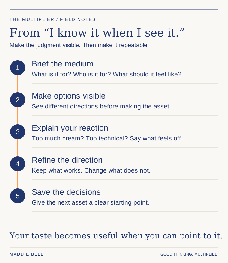
Open the diagram to view it at full size.
Begin with the world, not the colors
Most people hear “design system” and think fonts, colors and logos. Those matter. They are the tokens that help a system scale. But a useful design system begins earlier, with an idea about the world the brand is creating.
For Synapsa, an earlier brand story began with “first light”: helping people navigate possibility, with the sun coming up and the stars still showing what could be. That idea could inform color, photography, gradients, illustrations and interface choices. The important point is not that every brand needs a poetic story. It is that visual choices need a reason to belong together.
Before asking AI to make an asset, explain:
- 01
who the audience is;
- 02
what job the asset has to do;
- 03
what the person should feel;
- 04
which parent-brand references are load-bearing;
- 05
what may change for this medium.
I call this the word-vomit stage. I explain the situation in normal language, point to the existing brand material and admit what I do not know. “Fill in the gaps on anything I might have missed” is a useful invitation during planning. You are opening the creative space, not surrendering the decision.
Ask for directions you can compare
One design gives you one reaction. A few meaningfully different directions give you a decision.
Ask for distinct routes, then make each route prove itself through the actual components you will need. For a newsletter, that might include the navigation, article page, pull quote, framework diagram, episode card and email signup. For a deck, it might be the title slide, argument slide, data slide, customer proof and closing slide.
This matters because a mood board can hide weak mechanics. A beautiful hero does not tell you whether the system can carry a dense framework. A striking title slide does not tell you whether twelve charts will still feel like the same brand.
Look at the design system end to end before you disappear into one ad, one page or one episode. When you solve too deeply for the content inside a single unit, you can lose the brand around it.
Turn “I don’t like it” into usable direction
The most productive creative feedback has three parts:
- 01
Name the reaction. “This feels too refined,” “this is too flat,” or “now we are teal.”
- 02
Locate the cause. Is it the dominant color, the density, the typography, the image treatment, the hierarchy or the shape language?
- 03
Restate the intent. What should the audience feel instead, and which part of the brand should carry that feeling?
You do not need to arrive with perfect design language. Ask the question. Explain the feeling. Explain what is off. The AI can help synthesize the reaction, but the marketer still has to recognize what matters.
In my teal detour, the better question was not, “How do we make this teal option better?” It was, “What needs to be different for this to feel like my editorial platform while still owning the strongest parts of the parent brand?”
That reopened the right decision. The foundation could remain recognizable while differentiation moved into typography, gradient borders, diagrams, motion and editorial components. An email, a slide and a page do not need identical layouts. They need shared visual logic.
Record the choice so the team can reuse it
- 01 →Capture the reaction
Name what feels wrong, locate the visual cause and explain the intended effect. Keep the actual example beside the feedback.
- 02 →Approve a reusable boundary
Record the choice, why it belongs and where it should not be used. A boundary gives the system a decision it can apply.
- 03 →Produce and inspect
Give the next assignment the approved examples. Compare the rendered output with them and explain the misses before revising.
- 04 →Test in another format
Try the direction in a deck after a page. Return proposed brand changes to the owner; allow routine revisions within approved boundaries.
Check the result: review time shifts from repeating established direction to improving how the buyer understands the benefit.
Once a direction works, capture more than the hex codes. For every meaningful decision, record:
| Decision | Example | Why it belongs | Boundary |
|---|---|---|---|
| Background role | Approved page or component | Creates the intended visual weight | Do not use on long reading surfaces |
| Typography | Headline and body sample | Separates editorial voice from product UI | Keep body copy highly readable |
| Image treatment | Two approved examples | Extends the brand story | Avoid unrelated stock styles |
| Signature element | Diagram, border or gradient | Makes the system recognizable | Use as structure, not decoration everywhere |
The boundary is what turns taste into a system. “Use this gradient” is a preference. “Use it to mark moments of transition, and keep it out of dense body content” is guidance the AI and the team can apply.
You are aiming for enough control that you know the neighborhood of what you will get, then you refine during execution.
Pick one recurring asset this week and build a small sample sheet before producing the whole campaign. Ask for several directions. Compare the real components. Say what feels wrong and why. Then write the winning decisions, examples and boundaries into the system.
What I want is for that conversation to keep working after I close it. If we figured out why the design felt wrong, the next asset should benefit from that decision. Otherwise I am sitting there having the same conversation with a faster production tool.
Give the production agent the approved direction and examples before it starts. Build a review step that compares the rendered asset with those references and explains where it misses. Let the system revise within the boundaries you have already settled; bring a proposed change to the brand itself back to the person who owns it.
Try that on a different asset, not another version of the one you just finished. Can the system carry the same visual logic from a page into a deck? Do you spend less of the review repeating established direction and more of it improving how the benefit comes across?
Your taste does not become less human when you codify it. It becomes something the system can carry into work you did not personally direct.
Sources: My Expanding Your Design System training and MarketingOS walkthrough. Adapted from my original recordings and writing; practical worksheets developed for this collection.