

How to Build an AI Design System That Scales Your Brand
Lock the brand strategy. Pitch and choose a creative idea. Build the visual identity, prove it on a website, then scale across channels. The process, decisions and real artifacts behind Synapsa’s new system.

In this article
Your AI can make a website, an ad and a sales deck. The harder question is whether a buyer would recognize the same company in all three.
You can keep correcting each piece yourself. Or you can give the AI enough of your brand judgment that the next piece starts in the right place.
That takes more than colors, fonts and a folder of images. An AI brand visual identity, or VisID, explains how your positioning becomes a recognizable visual world, and gives people and AI the references, rules and assets to extend it. It connects what your brand means to how the work should look, read and behave.
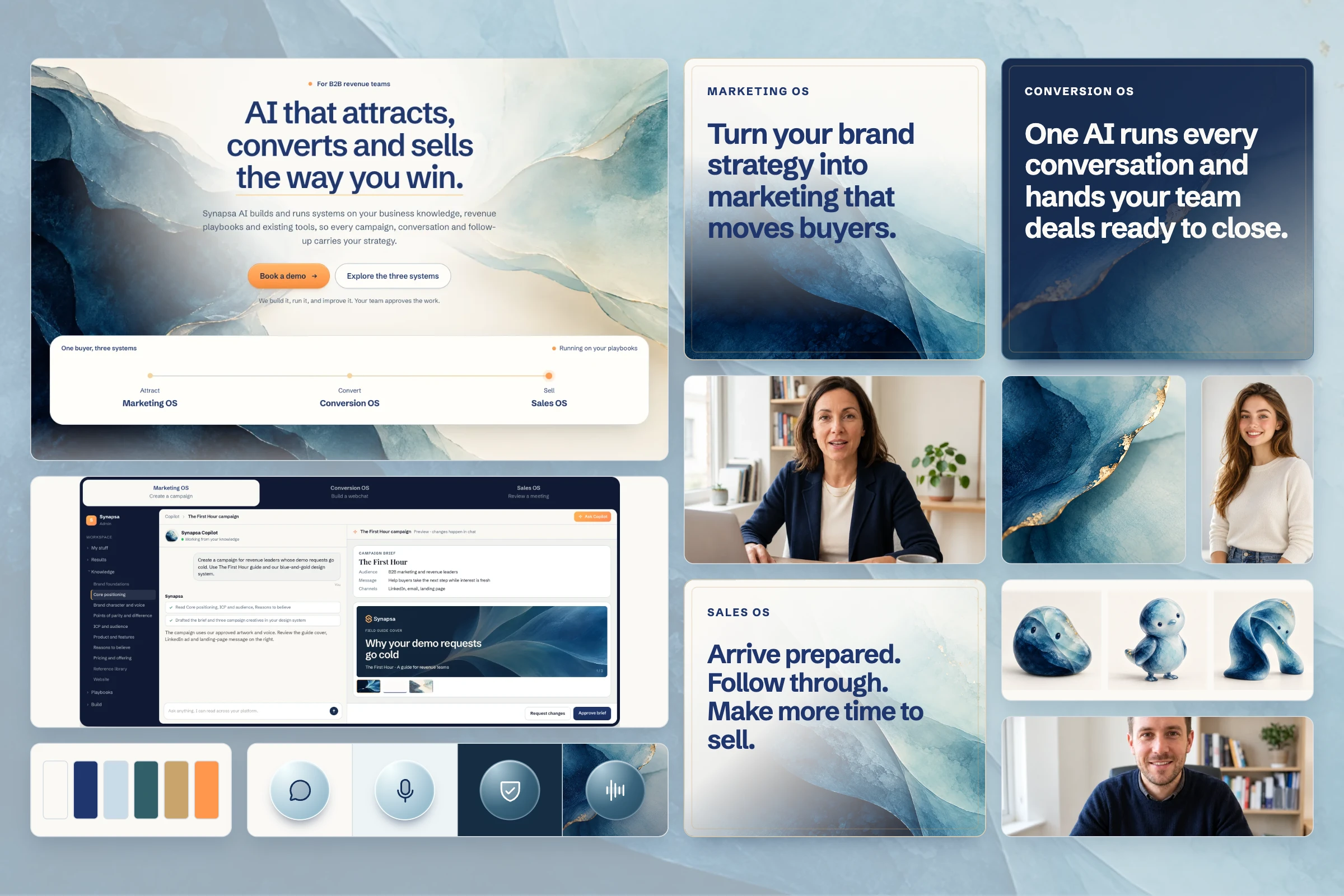
We built Synapsa’s new system this way, working through creative directions with Opus and Astra, testing them in the website, and expanding the chosen direction across our marketing. We made plenty of work we didn’t keep. The value came from knowing why, then preserving that judgment for the next person.
Here is the process I would use again. Each step leaves you with something the next step needs.
- Lock the positioning and brand character.
- Ask for complete creative pitches, not isolated images.
- Compare, iterate and buy one governing idea.
- Build its color, art and photography world.
- Set the typography and prove the treatments in a real website.
- Package the identity so people and AI can use it.
- Scale it across channels, checking what each format needs.
1. Lock the brand positioning and character first
Leave this step with: a shared account of who you serve, what you promise, why someone should believe you, and the character representing that promise.
The AI needs to know whose judgment it is expressing. Otherwise, “premium” might mean a luxury hotel, a wealth manager or a futuristic gaming company. All can look expensive. Only one might be right for your buyer.
Our positioning gave us the business story: Synapsa puts a team’s own brand knowledge and revenue playbooks to work across marketing and sales. The growth target goes up without a matching increase in capacity. Our job is to help that team’s best thinking reach more buyers.
Our character gave that story a person: the seasoned strategist you want in your corner. Someone who has carried the bag, built the playbook and sat in the hard seat. They carry the rigor so the buyer feels the ease.
Those two inputs shaped the design. Strong, clear type could carry the commercial argument. Art could create possibility. Product demonstrations had to show useful work and human judgment, not just suggest that something impressive was happening behind the scenes.
For your own brief, settle five questions before opening an image generator:
- Who is the buyer, and what are they trying to accomplish?
- What does your business help them do?
- What makes your approach worth choosing?
- What evidence supports that promise?
- If the brand were in the room, how would it think, speak and behave?
You don’t need a hundred-page strategy document. You do need agreement. A creative exploration can’t settle an unresolved positioning argument for you.
2. Ask AI to pitch a creative idea, a hero and a world
Leave this step with: comparable creative proposals, each built from the same core knowledge.
This was a key change in how we worked. We stopped asking only for something that looked good and specified what a creative pitch had to contain.
| Required in every pitch | What it helps you judge |
|---|---|
| Communication idea | The thought connecting the brand promise to the design. What should a buyer understand or feel? |
| Key visual: a homepage hero | The idea doing a real job, with your headline, description, logo and action. |
| Description of the visual world | Art influences, materials, light, color, photography and the relationship between them. |
| A few assets the brand could own | How the idea might extend into a graphic motif, image family or other recognizable element. |
We asked AI to consider different art styles, then turn them into creative territories grounded in our brand. Constructed sculpture suggested one kind of confidence. Brushwork suggested another. Flowing pigment opened up a different way to express connection.
A useful brief sounds like this:
Using our positioning and brand character, pitch three distinct creative directions. Ground each in a different artistic approach. For every direction, present a communication idea, a homepage hero using our core promise, a description of its visual world, and three ways it could extend beyond the hero. Explain why it fits our buyers and where it might fail.
The important part is the presentation contract. You can compare three complete ideas. You can’t fairly compare a beautiful image with a fully thought-through website.
We used Opus and Astra as AI creative collaborators, asking for fresh directions and critical reviews. The human job was to hold the brief steady and make the calls. Agreement from the model wasn’t the test; the work in the browser was.
3. Push the routes, then choose the idea worth scaling
Leave this step with: a chosen creative direction, the reasons it won, and the boundaries that make it yours.
We went outside our comfort zone. Some routes were restrained and architectural. Some leaned into expressive type or physical sculpture. Others brought us toward the flowing world that became Open Field.
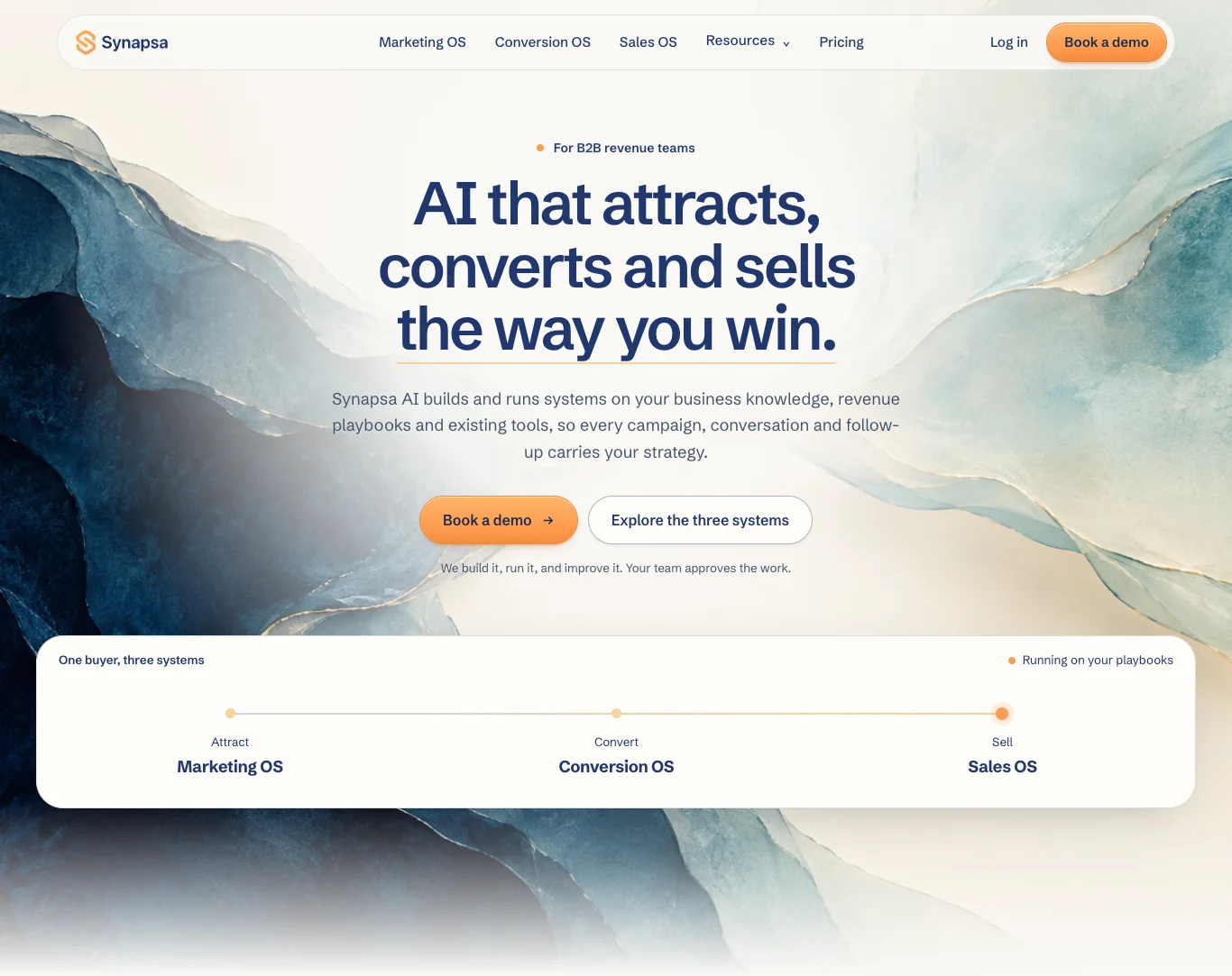
These are actual homepage studies from the exploration, not six crops of the final image. The captions name what each was testing; tap a hero to inspect it.
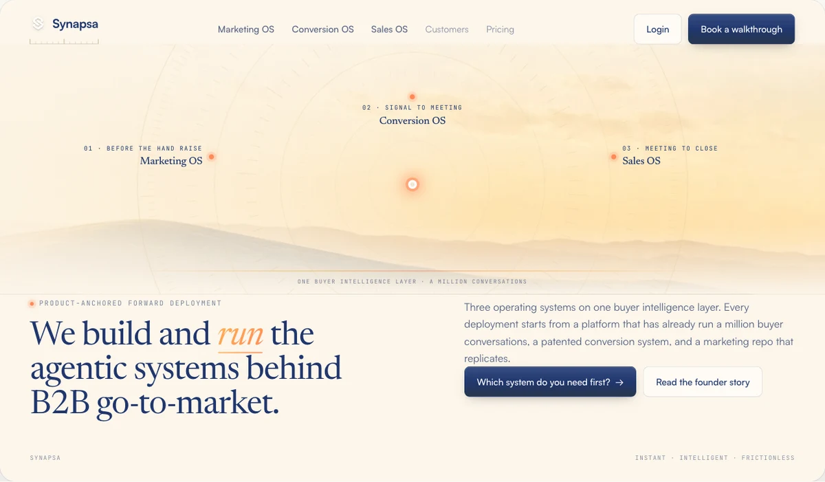
Enterprise structure and a dawn world.
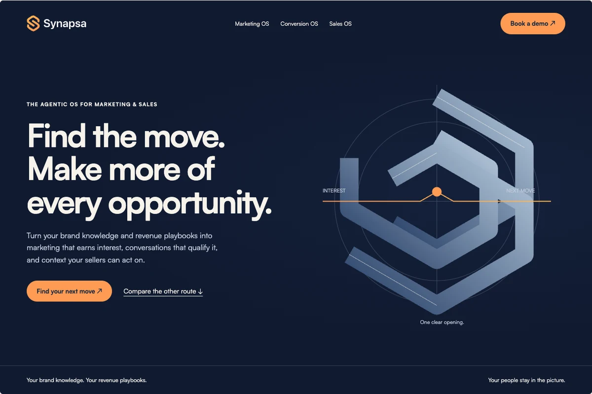
Precision, geometry and the opening that reveals the move.
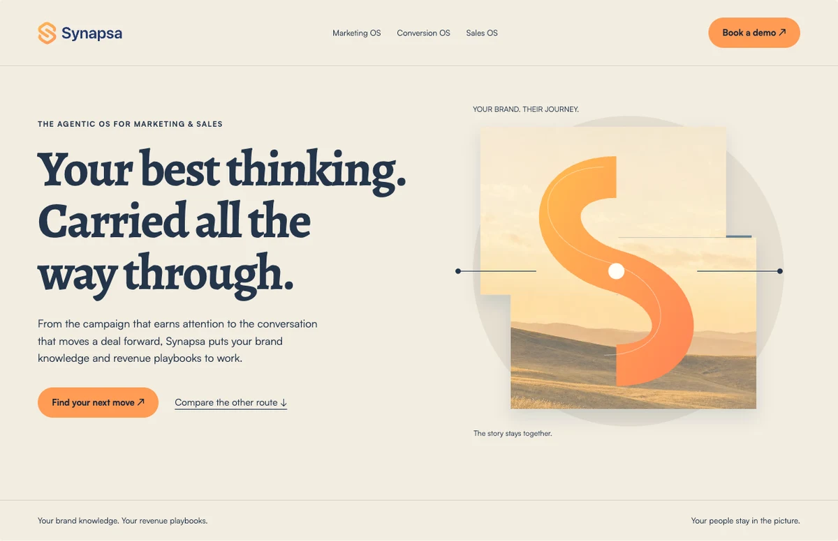
Warmth, collage and expressive typography.
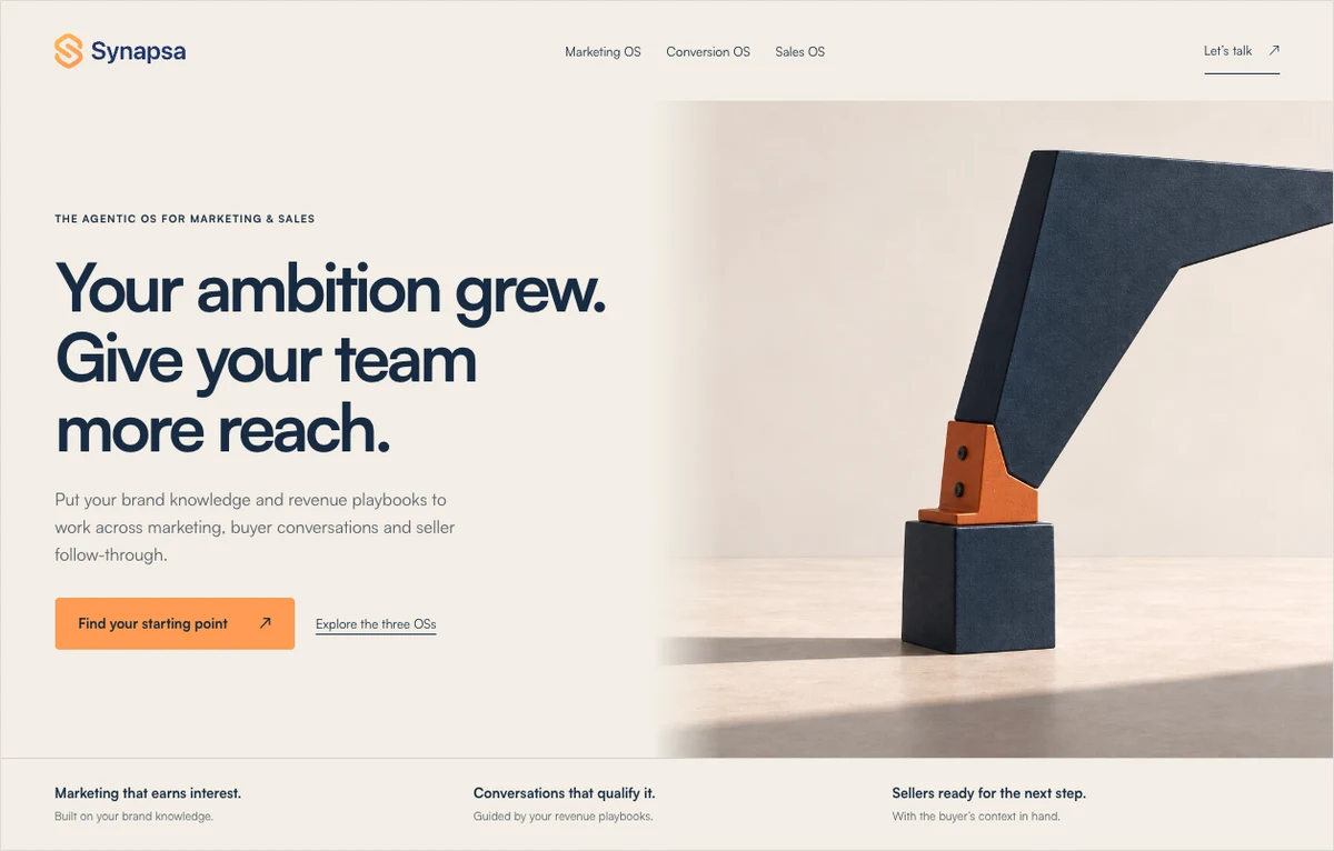
Sculptural balance and restrained confidence.
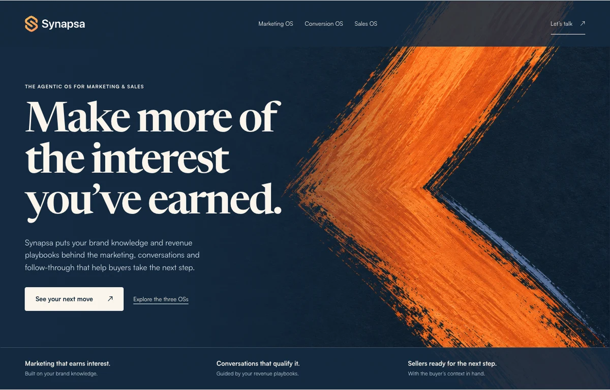
Brushwork, pigment and a more human mark.
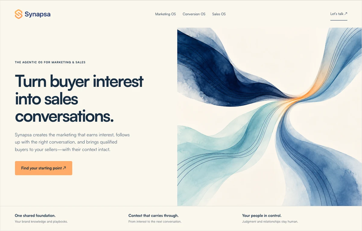
Flowing connection, on the way to Open Field.
The variation matters. If every option is the same layout with a slightly different blue, you haven’t really explored the idea.
But exploration also needs a point at which you buy the direction. We judged each route against three questions: Does it represent the brand? Does it make the business easier to understand? Can it become more than one beautiful page?
We learned to keep the commercial story consistent during that comparison. Open Field initially carried less of the strong business narrative than our First Light website. That made it look weaker for a reason that wasn’t really about the art. Putting the same promise into both let us judge the creative fairly.
The eventual choice had three clear contributions. First Light kept the enterprise clarity. Open Field supplied the blue pigment and gold-leaf environment. The Multiplier retained its editorial character. They had distinct jobs within one identity, rather than competing to decorate every surface.
The campaign line “Your best thinking. Connected.” captures the governing communication idea: your strategy should carry through the marketing that earns interest, the conversation that understands it and the seller who takes it forward. The flowing world gave that idea a visual form. Distinct paths could meet and carry on together. Quiet Leverage’s balanced sculpture expressed competence, but connection gave us more to work with across the whole buyer journey. That is the kind of decision to record: the thought you bought, how the art expresses it, and why it has room to grow.
We also had to refine what “art” meant. At one point we got photographs of gallery sculpture. Beautiful, but we wanted an artistic language that could shape the graphics themselves. Later, we made the hero too dark, then too white. The answer was substantial art at the edges and a protected field for the message.
This is what iteration should produce: a more precise direction. Keep the rejected work with the reason it lost, then clearly separate it from the approved assets. Nobody should have to guess which attractive old study is still allowed.
4. Build the color, art and photography world
Leave this step with: a palette with roles, a family of art compositions, photography direction and repeatable generation guidance.
Once we bought the idea, we could stop reopening the whole identity every time we needed an image. Now the task was to establish its range.
Give every color a job
Our light neutral ground gives the website clarity. Navy carries the message. Blue pigment and restrained turquoise give the artwork range. Gold belongs to selected material edges. Orange makes the commercial action easy to find.
The distinction is important. A broad palette doesn’t mean every section gets a new background color. We tried enough variety to see it become distracting. Color roles gave us range without making the page feel like several brands taking turns.
Describe the material as carefully as the color
Gold leaf and thin gold ribbons are not interchangeable. One feels bonded to a surface, with an irregular edge and a little shadow. The other can look like lines drawn over a graphic.
We wanted broad translucent pigment, depth where forms overlap, and selective foil. We did not want brown, bronze, orange glow or a diagram of an atom. “Blue and gold, premium” was nowhere near enough instruction.


The reusable direction became:
Broad translucent blue pigment surfaces, with navy recesses and pale blue transmitted light. Restrained turquoise where forms overlap. Sparse champagne-gold leaf bonded to selected edges, with subtle contact shadows. Keep a continuous quiet field for the copy. No brown, rust, bronze, parallel gold ribbons or literal landscapes.
Pair language like this with approved visual references. Then specify the composition’s job: centered copy, left-aligned copy, portrait format, a quiet transition or an expansive closing moment.
Our library reached 15 working masters with different roles. That is how you create useful range. Repeatedly cropping the hero doesn’t give a team an artwork library.
Keep people human within the world
The photography had to belong without looking as though everyone had been dipped in blue paint. We preserved natural skin tones and warmth, while pulling back environmental beige and yellow. One morning image stayed too warm beside the rest, so we removed it.


For the next person choosing or generating photography, “make it cooler” would lose that nuance. The guidance needs the setting, light, expression, crop and color balance, plus examples of what good looks like. Review people individually rather than applying a filter and calling it consistency.
5. Set the type, then make the website prove the system
Leave this step with: approved type roles and real examples of layout, controls, product demonstrations and responsive behavior.
With the visual world established, we could make the typography and interface treatments work with it. Schibsted Grotesk gave our commercial pages their clarity. Newsreader and Satoshi preserved the periodical feel of The Multiplier. The existing Synapsa logo remained the anchor.
Then the website became the proving ground. How wide could a headline be before it broke awkwardly? Where did generous spacing become an empty gap? When did a raised card clarify the hierarchy, and when was it just another box?
These decisions belong in the identity because they change how the brand feels. A team shouldn’t have to rediscover them page by page.
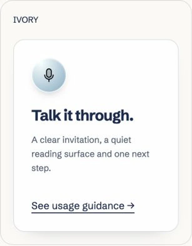
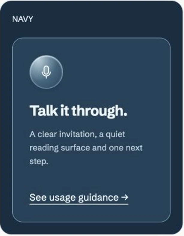
Product demonstrations needed particular attention. We had early previews with polished frames and generic content inside them. They filled the space without explaining the value.
The stronger version showed a recognizable chain of work: the request, the brand knowledge informing it, the finished creative, and the place a person reviews it. Our repository holds the positioning, voice, visual standards and examples; the demonstration needed to make that relationship visible.
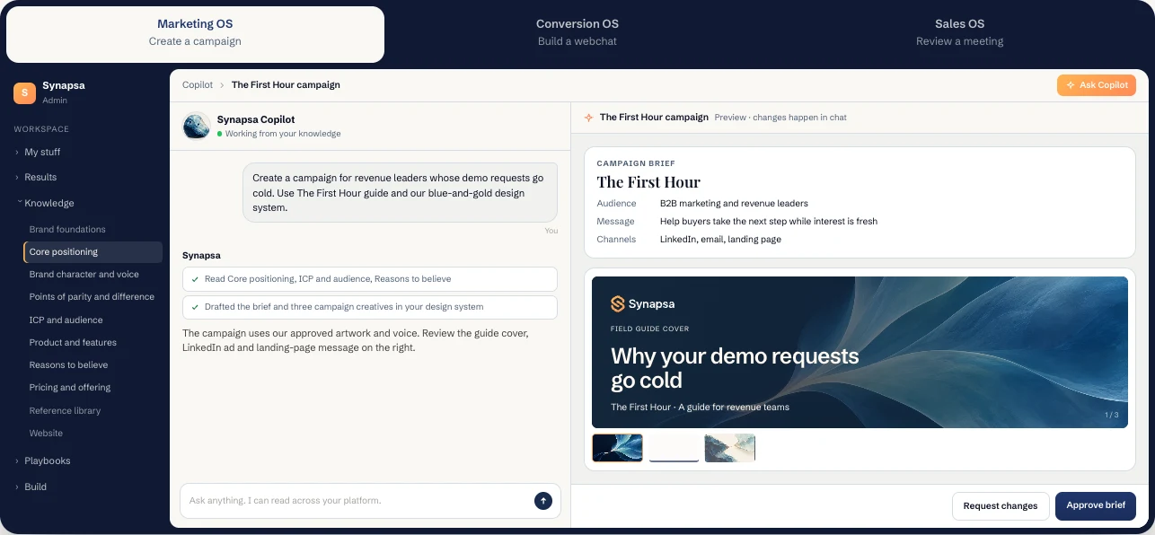
This is where the identity starts earning its place in a marketing operating system. The product example uses the same brand knowledge and creative standards the website is explaining. A buyer can see the relationship between strategy and output rather than being asked to imagine it.
Test the real page on a laptop and a phone. Fix unreadable detail, awkward ordering and broken crops before treating the component as a pattern to copy. A beautiful desktop screenshot is not yet a reusable system.
6. Package a VisID that another person or AI can use
Leave this step with: one current guide, the approved assets, working examples and enough direction to make a new choice.
An AI VisID is both visual and descriptive. The images show the standard. The words explain why it works and how to extend it. The implementation keeps small choices, like background temperature and spacing, from drifting.
Here is what the package needs to contain:
| Part of the system | What someone needs to find |
|---|---|
| Brand foundation | Positioning, buyer promise, character and the chosen communication idea. |
| Visual foundations | Logo use; color and type roles; hierarchy, spacing and layout principles. |
| Art and photography | Approved masters, composition roles, crops, lighting, grading and specific generation prompts. |
| Interface language | Icons, surfaces, depth, buttons, diagrams, readable product examples and interaction states. |
| People and AI presence | Photography rules, character and avatar masters, where each belongs, and how identity behaves. |
| Channel applications | Website, editorial, campaigns, decks, thumbnails and motion examples with format-specific guidance. |
| Use and review | Which version is current, what remains a study, what must be checked, and who approves a new direction. |
A folder of finished images is only one part of that package. The next person also needs to know where to put the words, what to do on a phone and which details must stay stable.
Characters and avatars test how far the idea can travel
We extended our material world into seven AI companions: Mica, Pip, Fold, Luma, Tuck, Wisp and Moss. They have different silhouettes and materials. Shared daylight, grounded shadows, blue pigment and an attentive posture make them a family.
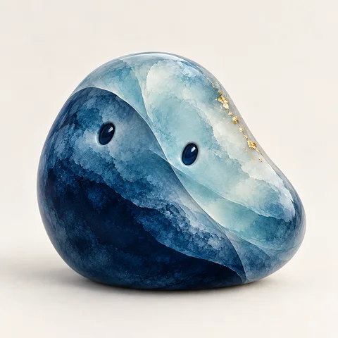
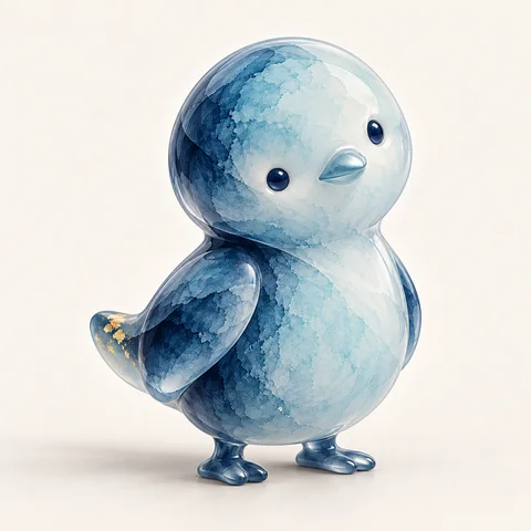
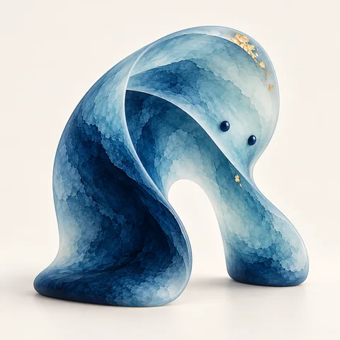
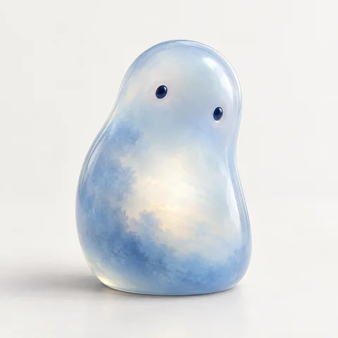
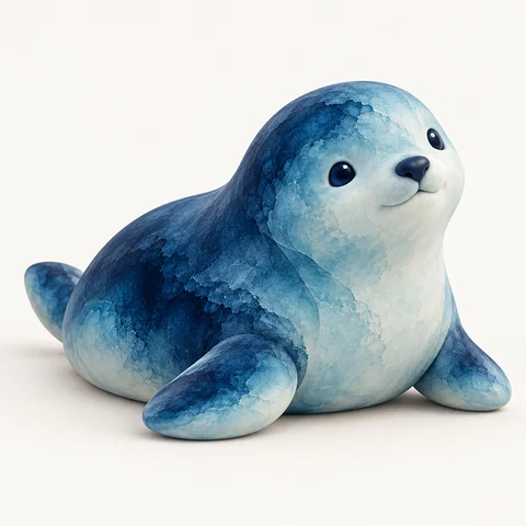
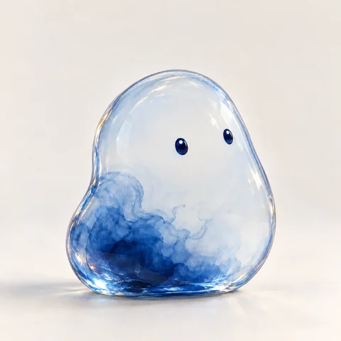
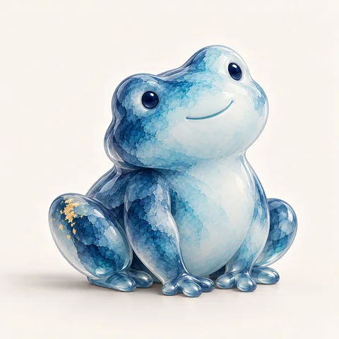
We also built human-form AI avatars for a more professional conversational presence. These are generated AI identities, not employee photographs. Their role differs from the companions used in building, teaching and marketing.



The guide goes beyond choosing a face: identify the AI role, keep the identity stable once a conversation starts, and review the tiny chat avatar separately from the full portrait. Those are brand-experience decisions as much as image decisions.
We even took the companions into a Higgsfield motion study. It was fun to see the world move. It also taught us that approval doesn’t automatically transfer from a still to an animation: the film had darker lighting and an earlier Wisp silhouette than the final family.
That distinction belongs in the handoff too. A compelling study can inspire the next round without becoming the reference everyone accidentally follows.
7. Produce across channels, then refine the deliverable
Leave this step with: a coherent body of marketing, plus the guidance each channel needs.
Now you can ask AI to produce with a much better starting point. It has the business knowledge, the creative idea, the visual world and examples of the standard. The brief can focus on the buyer, the message and the job of this particular asset.
Consistency doesn’t require the same composition everywhere. An awareness ad can lead with art. A product explanation should lead with what the product does. Editorial needs a reason to read. A sales slide needs a clear argument at presentation distance.
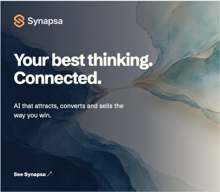
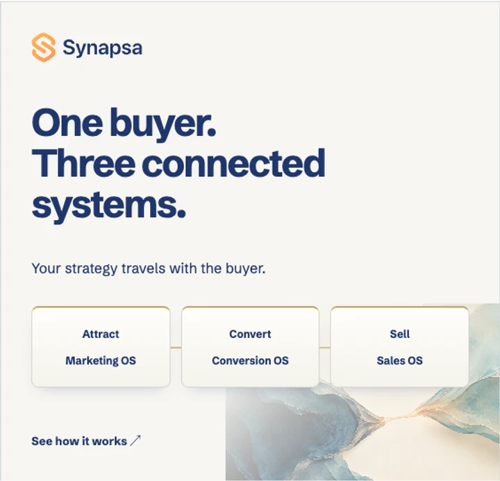
Review a campaign together, not one asset at a time. Does the ad introduce an idea the landing page develops? Does the follow-up help the buyer take the next step? Are the product examples using the same language and visual standards?
Then dial in the format. A thumbnail needs a clear focal point and a title that survives being small. A deck needs less on each slide and enough context for the presenter. A product walkthrough needs believable inputs and useful outputs. Motion needs its own pacing and lighting decisions.
When a deliverable doesn’t work, diagnose the right layer. If it looks like another company, revisit the references and rules. If it looks right but says nothing, revisit the communication. If the words disappear on a phone, repair the layout. Generating more variations is not a substitute for identifying the problem.
For your first run, choose three things you actually need: a website opening, a campaign ad and a product explanation. Take one idea through all three before scaling the library. Then give the package to someone who wasn’t in the workshop and ask for a fourth asset.
That is the handoff test. Can they make a new choice that belongs, without you supplying the missing reasoning?
Every repeated correction is a chance to improve the system. Keep the reference, the correction, the reason and the rule it becomes. Over time, the next brief gets to start with more of your best thinking already in place.
That is what we wanted for Synapsa, and what makes this work worth doing for a business. The brand becomes more than a set of things your team has to remember. It becomes knowledge they can put to work.
Put the process to work for your brand
Start with our free visual identity creative director guide. It gives you the brand interview, creative concept templates, an identity-file structure and a test for whether a fresh AI session can use what you built.
Save the guide in your project and ask your AI to work through it with you. You bring the brand knowledge and make the creative decisions.
Send me the free visual identity guide
Leave your email and we’ll send it over.